CUSO Spatio-Temporal Data Visualization Workshop, May 2017
Part 1: Introduction to Spatio-temporal visualisation design
Slides for part 1 available here: http://staff.city.ac.uk/~jwo/datavis/cuso2017/IntroSpatioTemporalDesign.pdf
Selected images and links from talk
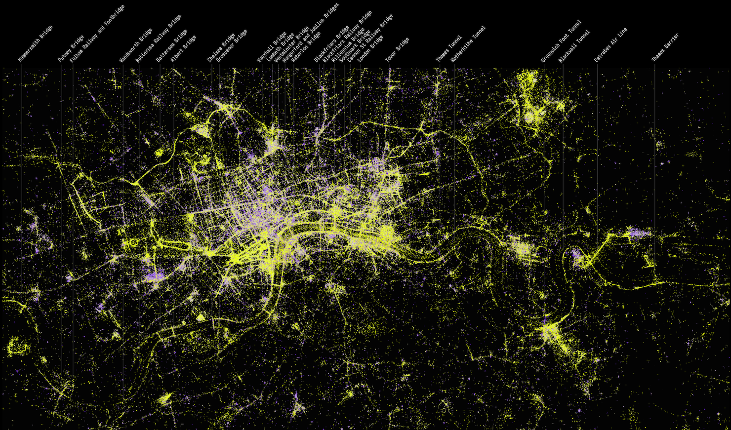
Figure 1. Flickr Photos in London
Interactive bicycle race visualization
Exercise: Symbolising and reordering a table
Using http://www.bertifier.com , select the European Values dataset and experiment with
-
Symbolising the numbers graphically
-
Reordering the rows and columns of the table so that location of your symbols carries useful meaning.
-
What kinds of patterns can you reveal in the data?
Exercise: Deconstructing a spatio-temporal visual analytic design
(These questions can be asked of any visualizaton design, but see if you can answer them for the VAST Challenge 2014 example)
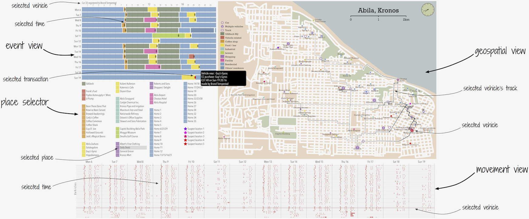
Figure 2. Visual Analytic design for the VAST 2014 Mini-challenge 2
-
What forms of D → V encodings have been used here?
-
Are there any hallucinators? (changes in visualization that don’t reflect changes in data)
-
Are there any confusors? (changes in data that are not reflected in the visualization)
-
How consistent is the visual-data correspondence?
-
How would you go about detecting hallucinators and confusers and correspondence?
-
Where have juxtaposition, superposition and explicit encoding been used? Are they effective?
See also (after completing this exercise!) :
For details of the challenge itself: http://www.vacommunity.org/VAST+Challenge+2014%3A+Mini-Challenge+2
Wood, J. (2014). Visual analytics of GPS tracks: From location to place to behaviour
available at http://www.staff.city.ac.uk/~jwo/datavis/cuso2017/papers/wood_visual_2014.pdf
and video explaing how the vis design answers the challenge: https://vimeo.com/100526597
Part 2: Relaxing Geography
Slides for part 2 available here: http://staff.city.ac.uk/~jwo/datavis/cuso2017/RelaxingGeography.pdf
London Bicycle Hire Visualization
Experiments in bicycle flow animation https://vimeo.com/33712288
"We are the City" https://vimeo.com/jowood/watc
TEDx talk on data visualization design for understanding cyclists' behaviour:
OD Maps and migration
-
Global migration viewer: http://www.staff.city.ac.uk/~jwo/datavis/cuso2017/migration
Exercise: Designing spatio-temporal datavis for movement ecologists
A movement ecologist wishes to understand goose migration across Europe.
She has GPS data for 25 geese showing their hourly movements over a 5 month period.
Geese do three things:
-
They nest, spending time at a single location
-
The forage for food – shorter trips to and from nest
-
The migrate – longer trips from central Netherlands > NE The don’t all show these behvaviours at exactly the same time, but all within an approximate 4 month period.
She tried to implement some Datavis using GoogleEarth (see slides).
(using pencil and paper) can you design a better data visualization to reveal spatio-temporal patterns?
Articles and books mentioned in talk
Bertin, J. (2010) Semiology of Graphics: Diagrams, Networks, Maps. ESRI Press
See http://esripress.esri.com/display/index.cfm?fuseaction=display&websiteID=190 for details.
Gleicher, M., Albers, D., Walker, R., Jusufi, I., Hansen, C. and Roberts, J. (2011) Visual comparison for information visualization. Information Visualization, 10(4) pp.289-309.
Available at http://cvev.bangor.ac.uk/paper.pdf
van Goethem, A., Meulemans, W., Speckmann, B. and Wood, J. (2015) Exploring curved schematization of territorial outlines. IEEE Transactions on Visualization and Computer Graphics, 21(8), 889-902.
Available at http://openaccess.city.ac.uk/8221
van Goethem, A., Reimer, A., Speckmann, B. and Wood, J. (2014). Stenomaps: Shorthand for shapes. IEEE Transactions on Visualization and Computer Graphics, 20(12), pp. 2053-2062.
Available at http://openaccess.city.ac.uk/14151/
Kindlmann, G. and Scheidegger, C. (2014) An algebraic process for visualization design. IEEE transactions on visualization and computer graphics, 20(12) pp.2181-2190.
Available at https://www.researchgate.net/profile/Gordon_Kindlmann/publication/265470662_An_Algebraic_Process_for_Visualization_Design/links/541030e10cf2df04e75b7707.pdf
Meulemans, W., Dykes, J., Slingsby, A., Turkay, C. and Wood, J. (2016). Small multiples with gaps. IEEE Transactions on Visualization and Computer Graphics, 23(1) pp. 381-390.
Available at http://openaccess.city.ac.uk/15167
Munzner, T. (2015) Visualization Analysis and Design, CRC Press
See http://www.cs.ubc.ca/~tmm/vadbook/ for details
Perin, C., Dragicevic, P. Fekete, J-D. (2014) Revisiting Bertin matrices: New interactions for crafting tabular visualizations. IEEE Transactions on Visualization and Computer Graphics, 20(12) pp.2082-2091.
Available at http://www.aviz.fr/wiki/uploads/Bertifier/bertifier-authorversion.pdf
Wood, J. (2015). Visualizing personal progress in participatory sports cycling events. IEEE Computer Graphics and Applications, 35(4), pp. 73-81. Available at http://openaccess.city.ac.uk/12351
Wood, J. (2014). Visual analytics of GPS tracks: From location to place to behaviour. Proceedings, Visual Analytics Science and Technology, VIS 2014
Available at http://www.staff.city.ac.uk/~jwo/datavis/cuso2017/papers/wood_visual_2014.pdf
Wood, J., Badawood, D., Dykes, J. and Slingsby, A. (2011) BallotMaps: Detecting name bias in alphabetically ordered ballot papers. IEEE Transactions on Visualization and Computer Graphics, 17(12), pp.2384-2391.
Available at http://openaccess.city.ac.uk/436
Wood, J., Dykes, J. and Slingsby, A. (2011) Visualizing the dynamics of London’s bicycle hire scheme. Cartographica, 46(4) pp.239-251.
Available at http://openaccess.city.ac.uk/538
Wood, J., Dykes, J. and Slingsby, A. (2010) Visualisation of origins, destinations and flows with OD Maps. The Cartographic Journal, 47(2) pp.117-129.
Available at http://openaccess.city.ac.uk/537