Automated Cartographic Relief Presentation
The production of high quality shaded relief is regarded as a complex skill requiring understanding of many competing design principles. Guidelines for the cartographer can be numerous and time consuming to follow. In contrast, most Geographic Information Systems provide automated shaded relief functionality that can produce quick and simple approximations of cartographic shaded relief. Such automated routines tend to ignore many of the guidelines recommended for manual production. This paper presents a series of visual experiments that lead to an automated process of cartographic relief presentation. The objective of the process is to produce improved relief representations by incorporating more of the guidelines traditionally followed when producing relief maps by manual processes. The result is a set of hill shaded relief maps that better reflect the underlying characteristcs of the terrain they depict allowing the viewer to gain a better understanding of the data being represented.
1. The Data
Four test datasets were used to explore different shading techniques (Figure 1). The hemisphere was used to explore the effect
of smoothly varying elevation with positive profile and plan curvature. The 'snowflake' is a reproduction of Imhof's object
(Imhof 1982, Figure 131, p. 179) used to explore the effect of lighting direction as well as the effects of shading sharp
positive and negative profile curvature. The Loess plateau is an SRTM derived surface providing an example of a dissected plateau
with sharply incised valleys at multiple scales contrasting with smooth higher elevation surfaces. The Mount Rainier surface
represents a typical glaciated surface charactersied by sharply expressed upland ridges contrasting with smoother lowland valley
features.
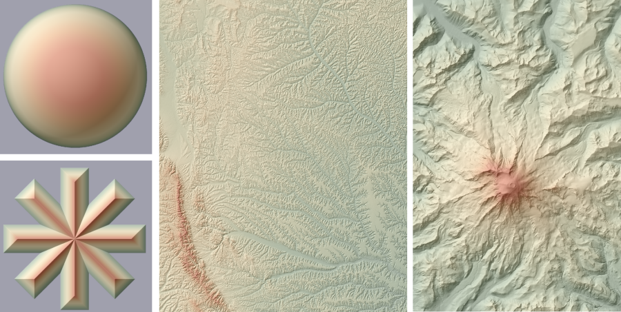 Figure 1 - Four test surfaces (a) Hemisphere; (b) Snowflake; (c) Loess plateau; (d) Mt Rainier
All data were processed and rendered in LandSerf 2.3. Other than resizing to fit on these pages, there was no post-processing of the images in any graphics package. LandScript was used to generate multiple image sequences, the scripts provided in the appendix below.
2. Illumination Models
2.1 Lambertian Hill Shading
The simplest and most widely used model of relief shading is to calculate Lambertian reflectance - that is the amount of
light reflected at any given point is considered directly proportional to the cosine of the angle between the surface normal (N)
and the incident light (L).
![]()
This allows local patches of the surface pointing away from a light source to appear dark, and those slope normals
parallel to the light source to show maximum reflectance. The surface is assumed to reflect all light that strikes it and appears
equally bright from all viewing directions. While not a realistic model of landscape reflectance, it provides a conveniently calculated
and cartographically neutral model.
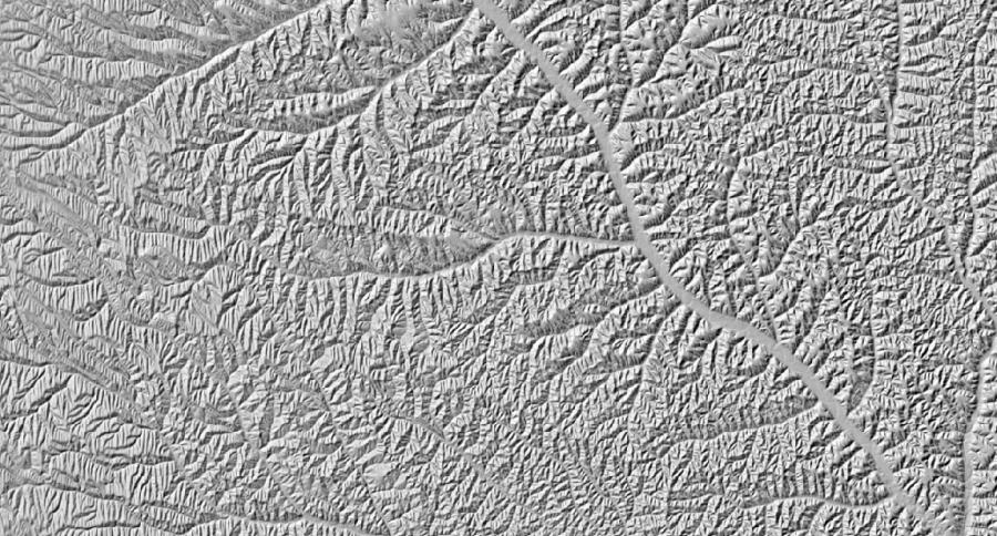 Figure 2 - Loess plateau shaded using simple Lambertian lighting model.
Lambertian shading can be calcuated for any cell in a gridded elevation model as follows:
reflectance = sin(phi).sin(slope) + cos(phi).cos(slope).cos(lamda-aspect)
where phi and lamda are the vertical and azimuthal angles of the light source
and slope and aspect represent the cell's slope normal.
2.2 Phong Illumination
While simple to compute, the main weakness with the Lambertian illumnation model is that it offers the cartographer very little control over the apparent surface texture being illumnatated. This can result in surfaces that appear too matt or shiny, or too flat. The linear relation between illumination and slope steepness can also hide more subtle variations in local relief.
Greater flexibility is offered by the Phong illumination model that allows the contribution to the light reflected to the viewer
to be broken down into diffuse, specular and ambient components. Additionally, the degree of apparent shine of the
surface can be controlled with a non-linear exponent value alpha:
![]()
where ka kd and ks are the ambient, diffuse and specular components of the reflected light.
The ambient component of reflected light simply controls the global lightness of the shaded map, so is not explored in any depth here.
In order to investigate the most appropriate values of diffuse, specular and shine components, each was varied systematically over the
various test surfaces.
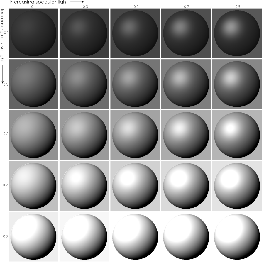 Figure 3 - Variation in diffuse and specular light for sphere object.
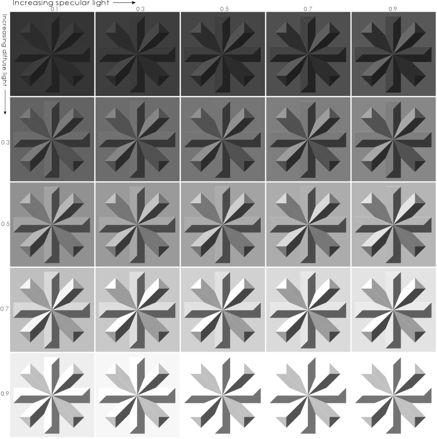 Figure 4 - Variation in diffuse and specular light for Imhof snowflake.
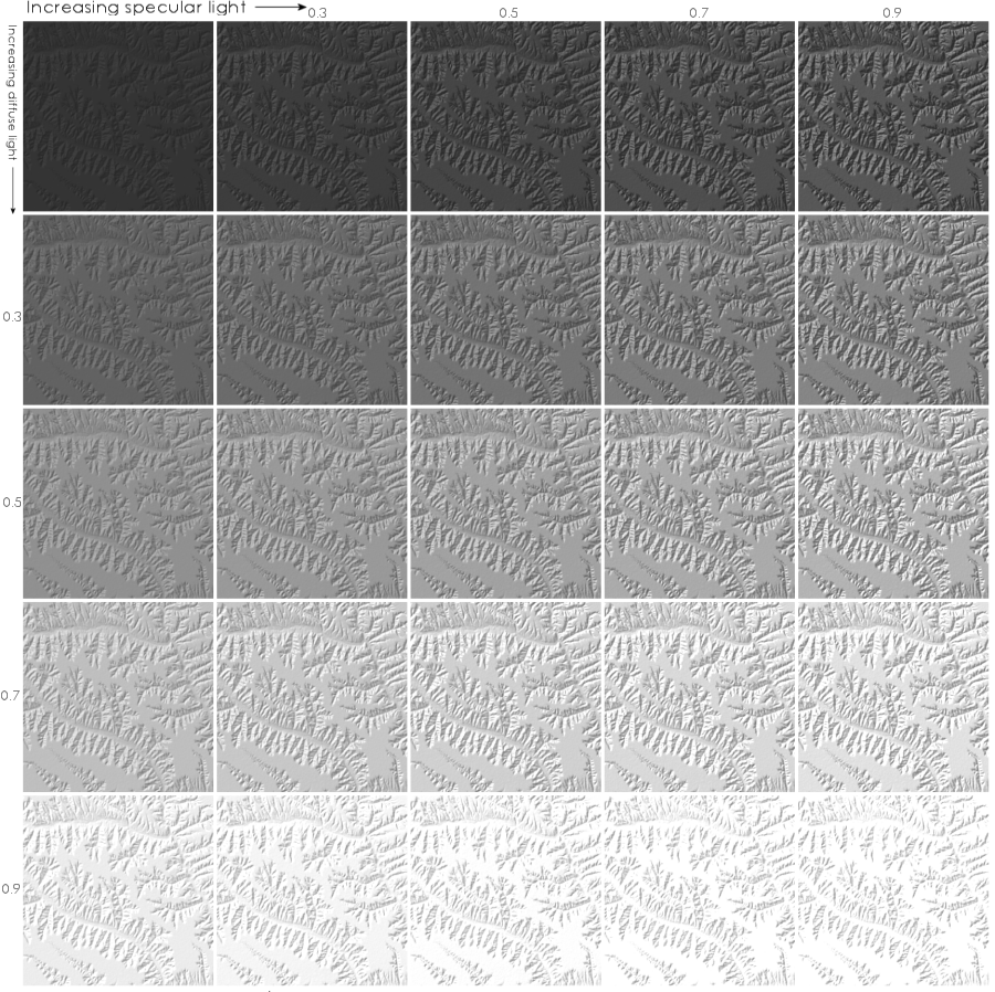 Figure 5 - Variation in diffuse and specular light for Loess Plateau DEM.
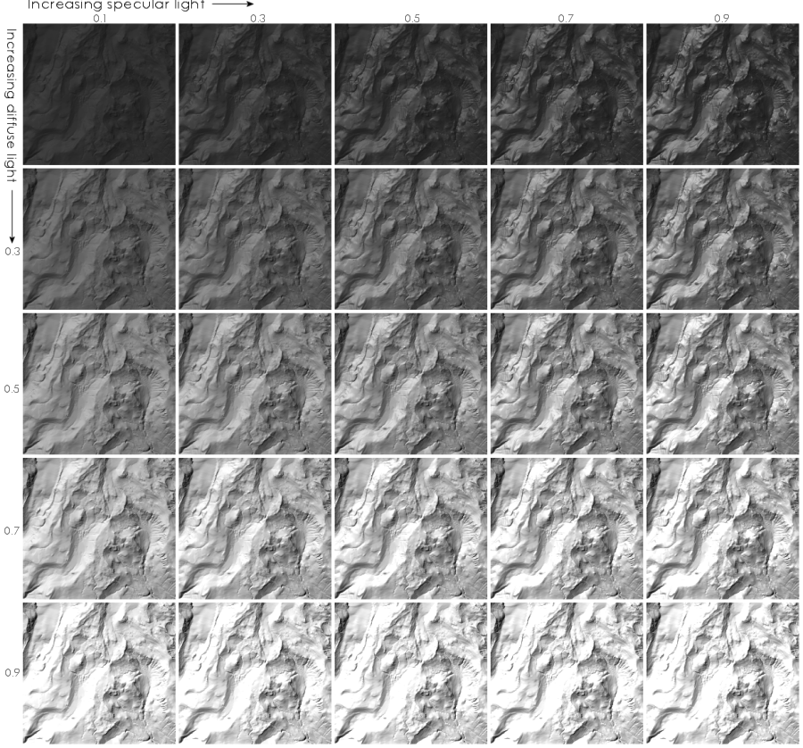 Figure 6 - Variation in diffuse and specular light for subsection of Mt Rainier DEM.
In all cases, low values of diffuse and specular light reduce the range of illumination values over a surface and consequently offer poorer relief repsresentation. High values of diffuse light increase that range, but at the cost of reducing the contrast between surface normals that are a moderate angle from the light vector. At its most extreme, high diffuse and specular components act as a coarse classifier of surface normals into those that refelct the light (white) and those that do not (black). Again this is undesirable for relief shading since more subtle varition in surface topography is not represented.
The spherical test object provides a useful basis for selecting a diffuse/specular combination that maximises dynamic range of greyscales while showing a more uniform range of intermeidate grey levels. Selecting the combination without the 'over-exposed' reflective white spot, but with maximum greyscale variation would suggest an optimum pair of values around kd=0.5 and ks=0.7. This combination appears to be discriminating for all of the other test surfaces shown in Figures 3-6. Increasing the specular component slightly tends to emphasise local relief (e.g. see Figure 5 - Loess Plateau), while increasing the diffuse component can marginally increase the effect of more regional azimuthal changes (e.g. see Figure 6 - Mt Rainier).
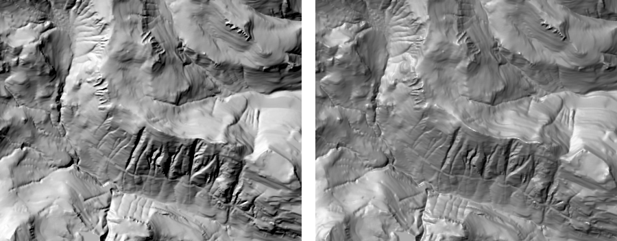 Figure 7 - Comparison of (a) Lambertian and (b) Phong illumination (kd=0.5 and ks=0.7) of Mt Rainier DEM.
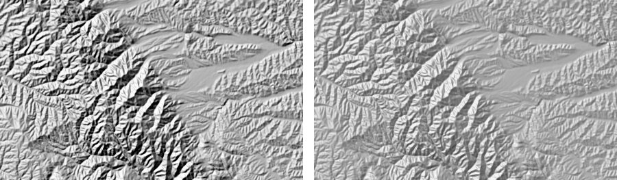 Figure 8 - Comparison of (a) Lambertian and (b) Phong illumination (kd=0.5 and ks=0.7) of the Loess Plateau DEM.
3. Light Direction
By convention, most relief is illumnated from approximately the top-left of the image. For good reason, this avoids the 'relief inversion'
produced by illuminations from the bottom of a map. When interpreting real 3-dimensional environments, we are used to sunlight and other
light sources to come from above us. Imhof agrues that the preference for lighting from the top-left rather than top-right is a consequence
of dominant right handed cartographers requiring a light from the left to avoid being shadowed by their hand as they draw.
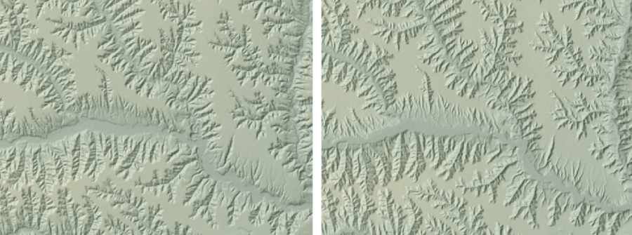 Figure 9 - Loess plateau with illumination from (a) NW; (b) SE. Note the relief inversion in the right-hand image and the greater discrimation between sides of valleys running NE-SW compared to NW-SE.
However, such directional lighting introduces problems of selectively emphasising arbitrary elements of a terrain. Imhof (1982) points
out that a light source that is tangential to local surface normals will over-emphasise 'modulation', or local surface relief. Equally,
a light source parallel to a surface normal will tend to flatten its appearence. He recommends that the cartographer provides a
dominant lighting direction approximately from the top-left, but "should introduce clever unobtrusive, localised changes in the main light direction.
He should let the light rays wander about, as it were, along the slopes and around the individual mountain masses" (Imhof, 1982, p.174). He illustrates
the problem and solution with Figure 10 reproduced below.
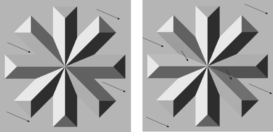 Figure 10 - Relief of the 'Imhof Snowflake' with (a) single lighting direction from 292o; (b) Locally modified lighting direction. (reproduced from Imhof 1982, p.179)
Modifying automated shaded relief calculation to account for Imhof's recommendations remains challenging since local modification of light direction is not only dependent on local aspect direction, but also the local configuration of slope facets. Two facets with the same surface normal may be shaded with a different grey level depending on the direction of nearby surface normals. Several attempts to bypass this problem in automated cartographic production have been suggested. Bressel (1974) suggested varying light direction based on a piecewise linear adjustment in lighting direction. Horn (1981) points out that the success of this process depends on the ability to identify regional variation in slope normals and not just those at the point at which incident light is being estimated. Smith and Clark (2005) suggest the use of unbiased morphometric measures such as curvature to highlight local relief. While this may produce a useful analytic representation for exploring landforms, it does not produce a realistic or intuitive picture of surface form suitable for the novice.
3.1 Brewer and Marlow Slope/Aspect Categories
Horn (1981) suggested that the conflict produced by two facing slope facets sharing the same grey level could be eliminated by using
non-overlapping colours to map the orthogonal surface properties of slope and aspect. This idea was developed by Brewer and Marlow (1993)
who suggested using variations in hue to represent different aspect directions and saturation to represent different slope categories.
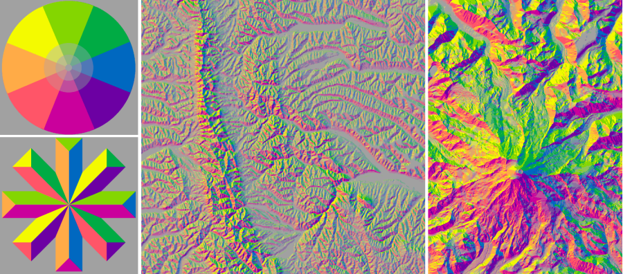 Figure 11 - Relief coloured according to the recommendations of Brewer and Marlow (1993)
By combining hue with saturation to represent slope steepness, a more directionally independent view of terrain is produced. This allows discrimination of features in all directions. By categorising slope into only 3 levels with corresponding levels of saturation, a clearer contrast is implied between areas of low and high relative relief. For example, in the Loess region (centre of Figure 11), the north-south running mountain range is distinct from the dissected channels of its surroundings. Likewise in the Mt Rainier map (right of Figure 11), the smoother glacier covered areas and lowland valleys can be distinguished from the rougher upland regions.
The problem with this approach is that it produces decidedly unnatural looking terrain, and in using both hue and saturation to represent relief, limits the scope for other terrain properties to be shown cartographically (e.g. hypsometric tinting). Depending on an individual's colour discrimination there also remains a possible azimuthal bias produced by the variation in hue with aspect. The quantizing of slope and aspect into 4 and 8 categories repectively also removes the more subtle changes in surface form present in smooth surfaces. This is most evident in the hemispherical test region (Figure 11, top-left).
A compromise between the directional bias and high level of detail of conventional automated shaded relief, and the stylised categorical
classification of Brewer and Marlow can be achived by combing the hue-saturation of the latter with the intensity of the former. Shown in
Figure 12 below, this produces a colour scheme reminiscent of Imhof's Walensee gouache paintings.
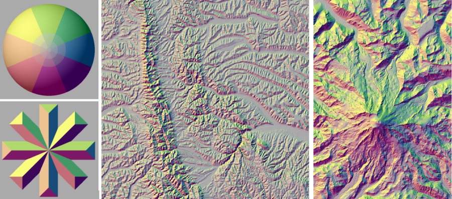 Figure 12 - Brewer and Marlow relief colouring combined with value based shaded relief
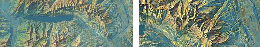 Figure 13 - Imhof's 'Karte der Gegend um den Walensee', 1938 showing enlarged section to the right.
3.2 Combining Cold and Warm Lighting
The problem that remains with the modified Brewer and Marlow shading scheme is the full use of colour space to represent relief alone. This makes it less suitable for combination with other data sources to produce a single composite image. An alternative approach is to calculate shaded relief using phong shading, but with multiple coloured light sources from different directions. The advantage of modelling different light sources is that this illumination can be used to modulate surface colour, allowing hypsometric or other tinting to be applied.
The use of warm and cold colours has been recommended for manual shaded relief production (e.g. Imhoff, 1982; Jenny and Räber, 2004)
as well as for more stylised technical drawing (e.g. Gooch et al, 1998). In this experiment, two light sources were used.
One using 'warm' light, the other using 'cold' light. Each light was scaled such that any part of the surface that receives equal
amounts of the two light sources is rendered with white light (effectively a greyscale depending on the intensity of incident light).
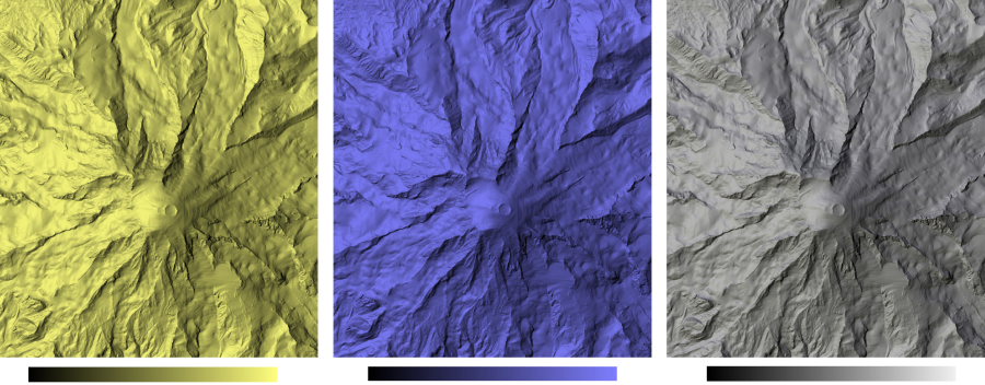 Figure 14 - Combining warm (yellow) and cold (blue) light sources.
By varying angle between the two light sources, the degree of aspect-dependent colouring of the surface can be controlled. Where light
sources diverge greatly, opposite valley sides are bathed in cold and warm light respectively. If the angle between light sources is
reduced, there is decreasingly little difference in those valley sides. The test surfaces were all rendered using diverging light sources
that differed in azimuthal direction from 0-90 degrees and are shown below in Figures 15-18. Cold light was projected clockwise from
the mean lighting direction, and warm light anti-clockwise, thus mimicing northern hemispherical lighting conditions.
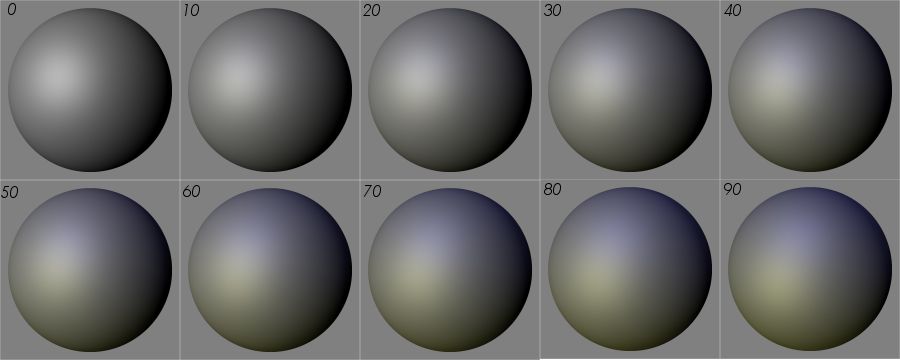 Figure 15 - Diverging warm and cold lighting for Sphere test object.
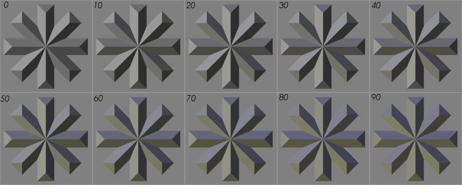 Figure 16 - Diverging warm and cold lighting for Imhof snowflake test object.
 Figure 17 - Diverging warm and cold lighting for Loess DEM.
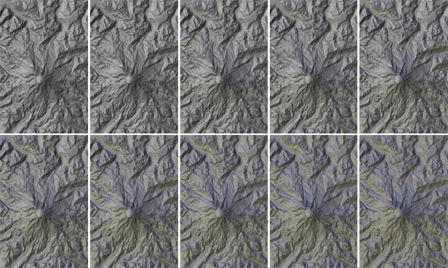 Figure 18 - Diverging warm and cold lighting for Mt Rainier DEM.
In the case of the Sphere, Snowflake and Mt Rainier test surfaces, increasing light divergence beyond about 30 degrees introduces a sufficiently large yellow-blue tinge to the image to become distracting and potentially to interfere with hypsometric tinting or other surface colours. Below 20 degrees divergage, the effect of the two colours is probably too subtle to offer any significant benefit. This would suggest, that an optimum divergence using the given blue and yellow lighting schemes may be somewhere around 20-30 degrees.
However, the effect on the Loess test surface appears initally to be more subtle. Even at 90 degrees, only the faintest tinting is
visible. This effect is due largely to the higher resolution of the DEM (shrunk to fit on this page) and the nearer the resolution
of the DEM to the scale of the features being mapped. Figure 19 shows two small subsections of the Loess DEM illumnated with a 30 degree
divergence. Here the effect of the lighting is more obvious. This in turn would suggest that any automated relief calculation should take
into account the scale of the features being mapped - practice recommended by Imhof when performing manual map generalisation (Imhoff, 1982, pp.188-190).
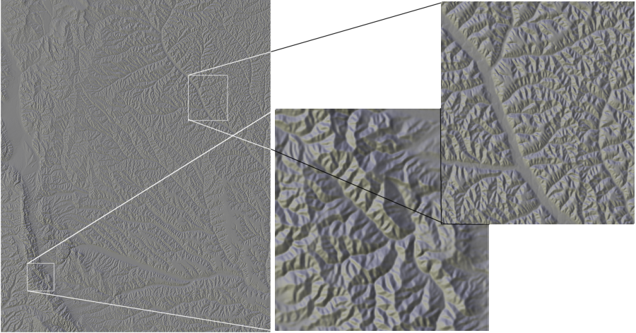 Figure 20 - Larger scale sections of the Loess DEM with 30 degree diverging light sources.
4. Scale
At the heart of any effective cartographic output is the appropriate use of generalisation. Guidelines to cartographers producing relief maps emphasise the need to show both regional trends and local detail (e.g. Imhof, 1982; Jenny, B. and Räber, S., 2004; Patterson, 2004). Conventional automated relief production tends to process local surface detail only. Due to the likely positive spatial autocorrelation of terrain, this can also reflect more regional trends, but there is no guarantee that this is the case. One of the characteristics of automated relief production is that insufficient generalisation takes place, leading to a degree of visual clutter obscuring more regional trends.
To investigate methods of relief generalisation, Phong shading was calculated at a range of scales defined by the size of window used
to estimate surface normals. Figures 21-27 below show the effects of calculating relief at different scales, as well as blended images
that combine fine-scale and broad-scale trends.
 Figure 21 - Phong relief for Imhof snowflake object calculated at window sizes of 3, 5, 15, 35, 53 cells.
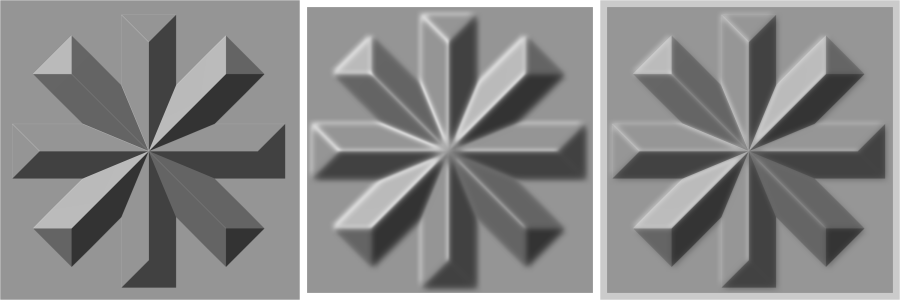 Figure 22 - Combining relief images for Imhof snowflake: (a) 3x3 window; (b)53x53; (c) combined 3 and 53 image.
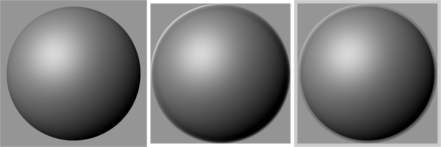 Figure 23 - Combining relief images for sphere object: (a) 3x3 window; (b)53x53; (c) combined 3 and 53 image.
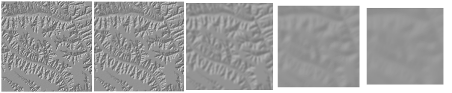 Figure 24 - Phong relief for Loess Plateau calculated at window sizes of 3, 5, 15, 35, 53 cells.
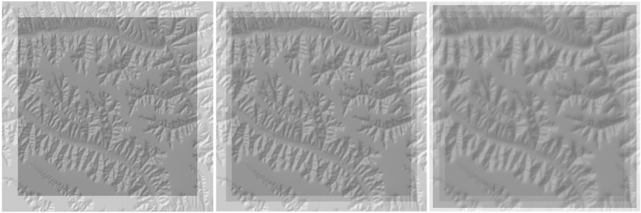 Figure 25 - Combined relief images for Loess Plateau (a) 3 and 55; (b) 3, 15 and 55; (c) 3, 5, 35 and 53.
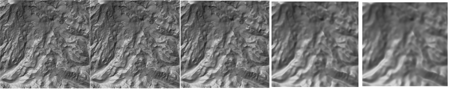 Figure 26 - Phong relief for SE Mt Rainier calculated at window sizes of 3, 5, 15, 35, 53 cells.
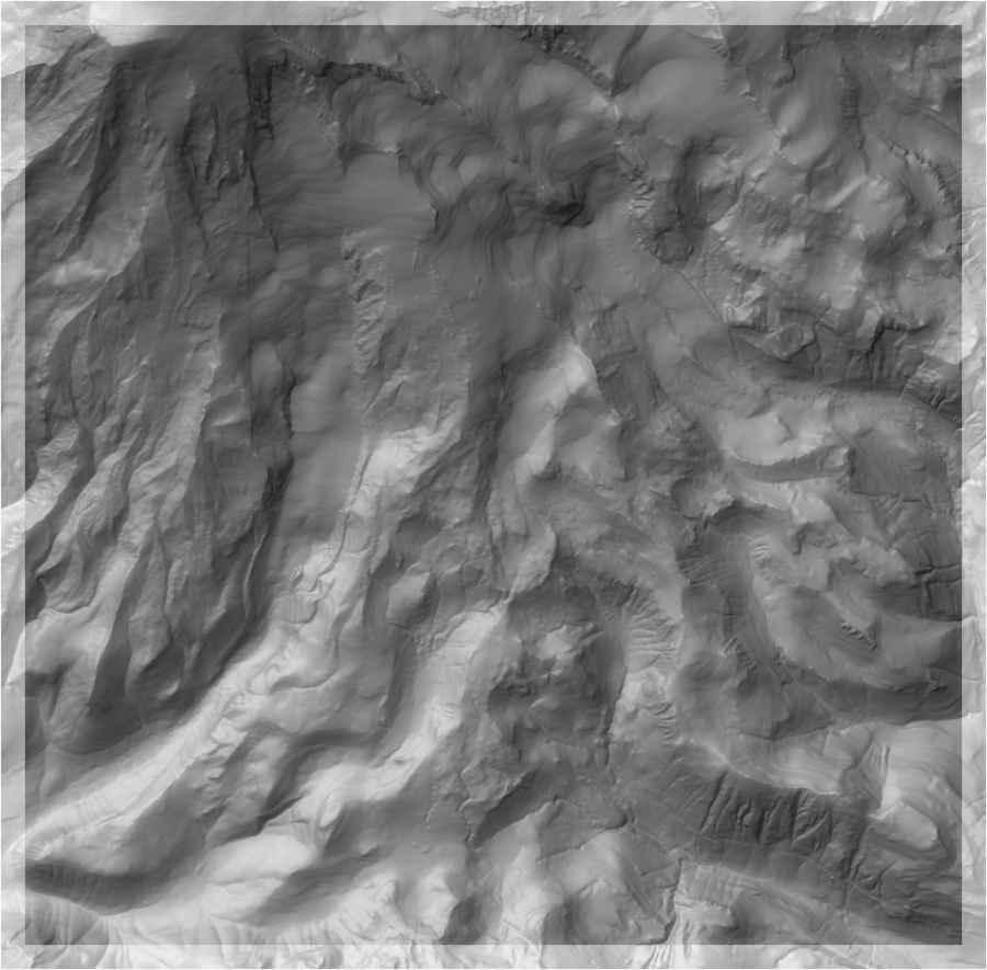 Figure 27 - Combined relief images for Mt Rainier at 3 and 55 cell window sizes.
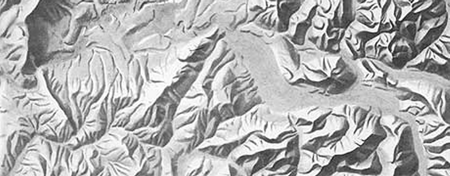 Figure 28 - 'Swiss style' pencil and ink relief map. Enlarged section from "Canton de Genève" © Kümmerly and Frey, Berne, 1959.
4.1 Using Colour Temperature to Distinguish Scales
Further separation of fine and coarse scaled releif can be achieved by using warm lighting to emphasise regional trends and cool lighting for local relief. Two examples are shown below in Figures 29 and 30.
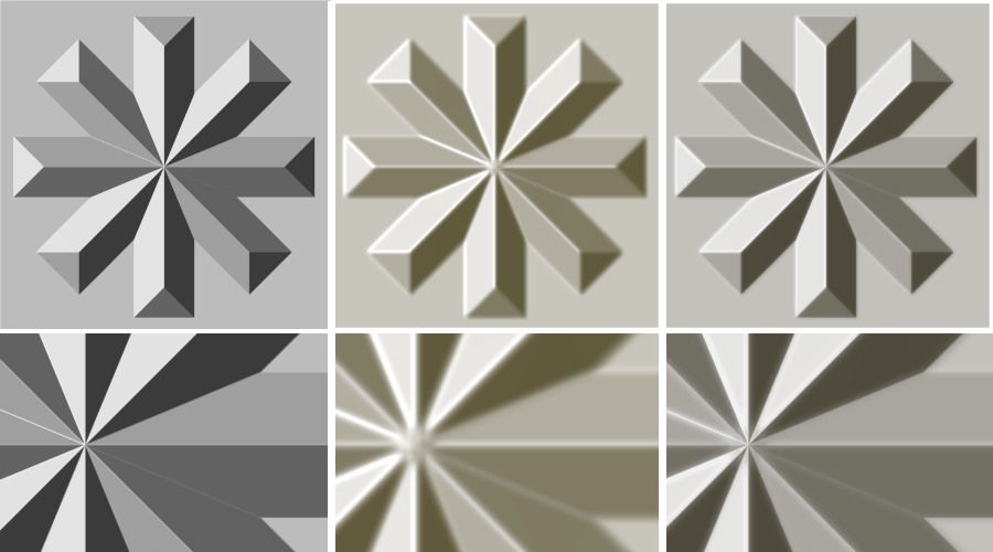 Figure 29 - Combining fine and course scale relief with different colour temperatures: (a) 3 cell window; (b) 53 cell window in warm light; (c) combined image.
Insets show fringing of sharp changes in slope. Note also how lack of regional context in insets can remove perspective effect, especially when using the 3 cell window.
Figure 29 - Combining fine and course scale relief with different colour temperatures: (a) 3 cell window; (b) 53 cell window in warm light; (c) combined image.
Insets show fringing of sharp changes in slope. Note also how lack of regional context in insets can remove perspective effect, especially when using the 3 cell window.
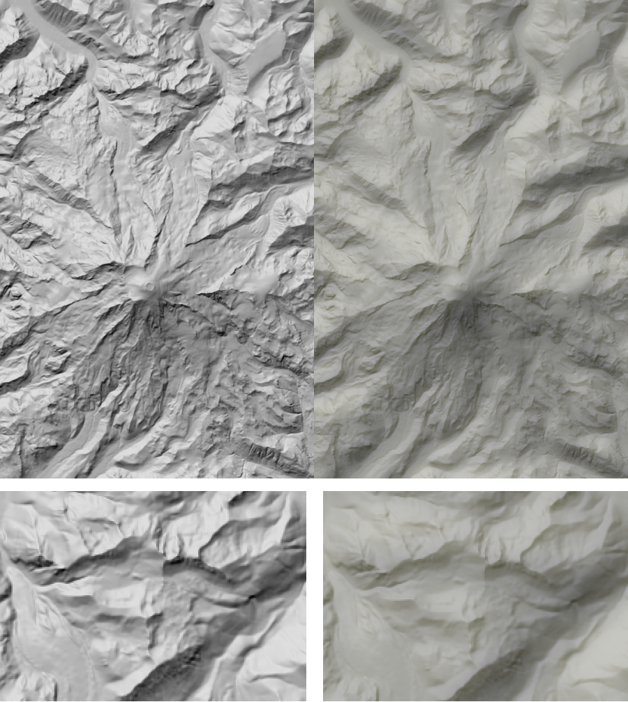 Figure 30 - Combined fine and course scale relief with different colour temperatures for Mt Rainier. 55 cell window in yellow, 3 cell window in blue.
Left, Phong shading using 3x3 window; Right combined 'cold' 3x3 and 'warm' 55x55 phong shading
Figure 30 - Combined fine and course scale relief with different colour temperatures for Mt Rainier. 55 cell window in yellow, 3 cell window in blue.
Left, Phong shading using 3x3 window; Right combined 'cold' 3x3 and 'warm' 55x55 phong shading
5. Combining Techniques
Muitliple light sources, multiple scales, Phong shading and hypsometric tinting can all be combined in a single automated process. Some examples are shown below.
 Figure 31 - Combined Phong shading of fine and course scale relief with different colour temperatures for Mt Rainier. 55 cell window in yellow, 3 cell window in blue with 30 degree diverergence in light source.
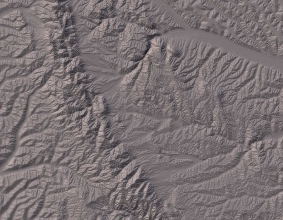 Figure 32 - Combined Phong shading of fine and course scale relief with different colour temperatures for Loess Plateau. 21 cell window in yellow, 3 cell window in blue with 30 degree diverergence in light source.
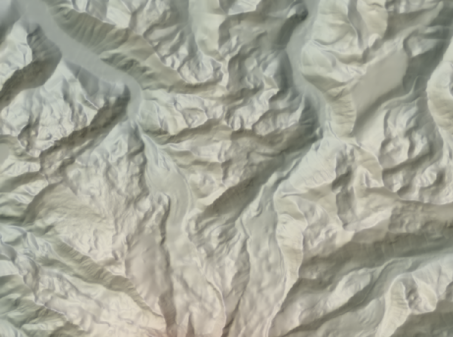 Figure 33 - Combined Phong shading of fine and course scale relief, directional colour temperature and 30% hypsometric tinting.
 Figure 34 - Combined Phong shading of fine and course scale relief, directional colour temperature and 70% hypsometric tinting.
6. Realism
 Figure 34 - Relief for object realism.
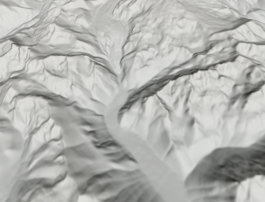 Figure 35 - Relief for landscape realism.
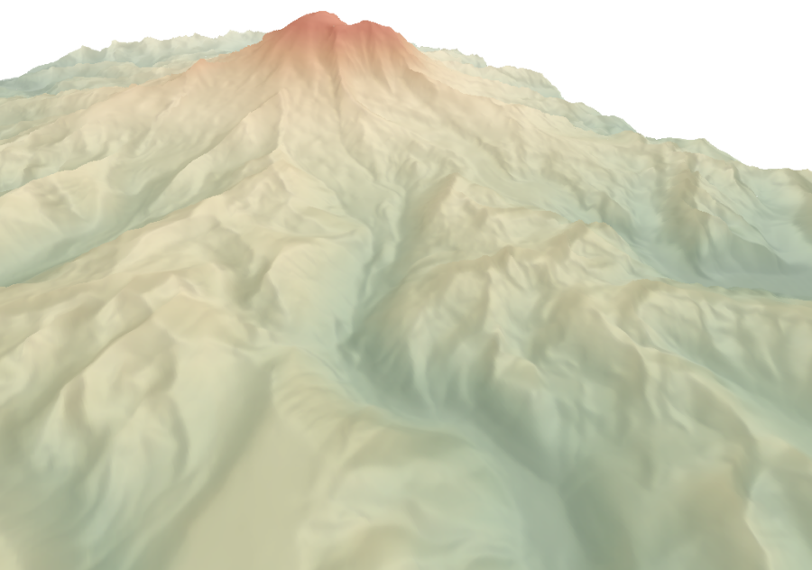 Figure 36 - Relief for landscape realism.
7. Conclusions and Future Developments
- Fractal dimension to determine scale combinations?
- Scale signature to determine scale combinations?
- Local changes in lighting direction?
- Elevation dependent processing ('Swiss school').
8. Scripts
The following LandScript files allow the automated production of most of the relief images presented in this paper.
- brewer.lsc - Creates a slope/aspect categorised map of an elevation model based on the guidelines of Brewer and Marlow (1993).
- divergingLights.lsc - Creates a sequence of blended images combining warm and cold light sources at different divergent angles.
- phongParams.lsc - Creates a sequence of shaded relief images using the Phong illumination model with systematically varying diffuse and specular light components.