Tutorial: One-Dimensional Signals in Matlab
Contents
Signals and 1D Matrices
In previous tutorials we have described the data in Matlab as Matrices; these matrices can have different dimensions. We can also think of these matrices as "signals" as we can be familiar with signals in other contexts. These signals can also be considered as mathematical functions especially when thinking of those which are mathematically described like sines or cosines.
For instance, repeated readings of a thermometer within a time frame would constitute a temperature signal. We can similarly think of audio signals or cardiac readings of an ECG as one-dimensional signals and images can be two-dimensional signals. In this tutorial we will present useful techniques to analyse 1D signals and images and volumes will be presented in subsequent tutorials.
One of the biggest advantages of using Matlab is the possibility of using mathematical functions, such as logarithms, square roots or absolute values, within matrices. In traditional programming languages, if you were interested in obtaining the logarithm of all the values of a matrix, you would need to loop over all the elements and obtain the logarithm of each element. In Matlab this is not necessary, the functions are applied to the whole matrix in one single instruction.
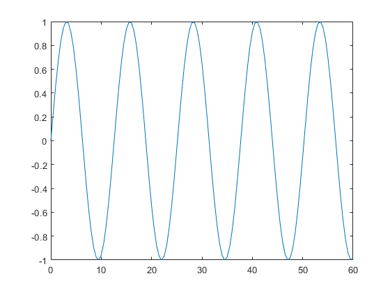
The following examples will use some of the most common Matlab commands and mathematical functions to illustrate how can we generate and manipulate data with a few, simple commands. First, a range of values is assigned to a variable. For example, we can consider these values as the times of an experiment that takes samples of a certain measurement every half a minute (0.5) for a space of one hour (0:60). Our variable 'time_range' would be defined like this:
time_range = 0:0.5:60;
Now imagine that the observation would behave in a sinusoidal way and are related to the time. We can then use the command 'sin' that calculates the sine values of each of the elements of 'time_range'.
observation_1 = sin (0.5*time_range);
Notice that we can have intermediate operations like multiplying by 0.5 before calculating the sine function. We can observe the function with the plot command:
plot(time_range,observation_1);
To obtain a second observation with the same dimensions as the previous one, but this one formed of randomly distributed numbers we could use the function 'size' and the function 'rand' in one single command:
observation_2 = randn(size(observation_1));
The command 'randn' generates random numbers that are distributed following a Normal or Gaussian distribution (mean = 0, standard deviation = 1). The output of the command 'size' is used by 'randn' to generate a matrix of the same dimensions as 'observation_1' with the random numbers.
plot(time_range,observation_1,'b-x',time_range,observation_2,'r:o');
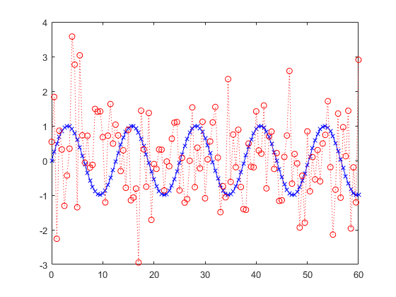
Notice how we diplayed both signals in the same command. For each signal we used three arguments: horizontal values, vertical values and the third argument ('b-x','r-o') is the shorthand notation to specify a colour (blue/red), a continuous or dotted line (-/:) and cross or round markers (x/o). There is a wide range of possible colours, lines and markers to be used. These are especially useful when plotting several lines in the same figure.
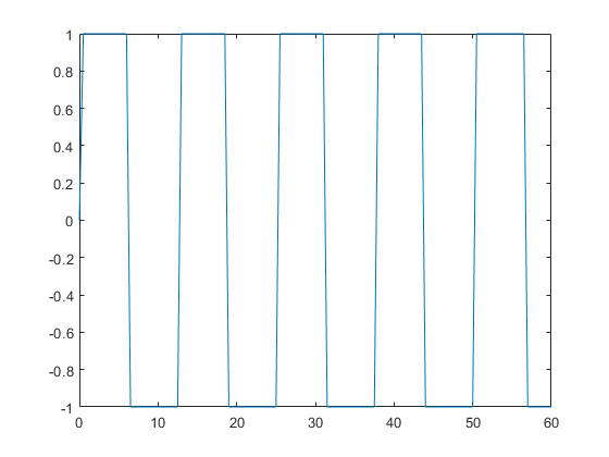
We can also generate signals using functions on other signals. In this case we will apply the function 'sign', which results in +1, -1 or 0 depending on the sign (thus the name of the function) of the values, disregarding the magnitudes.
observation_2           = sign(observation_1);
plot(time_range,observation_2);
At this point we can realise that observing the actual values of the matrices is not always the best option to analyse our data. Matlab is particularly good to display matrices in many different graphical ways. Some programmers sometimes prefer to use traditional numeric programming languages like "Fortran" or "C", in part because they have complete software solutions that have been developed over many years and they do not wish to migrate to Matlab, and also because in some cases those programmes may run faster than Matlab. However, they prefer to use Matlab to display the output of their programmes, as Matlab is very good for graphical display, and far easier than those programming languages.
Random numbers
Matlab has many functions with which it is easy to generate and manipulate data sets with a few simple commands. Some of the most useful functions to generate data are those that create matrices with zeros, ones or random values:
matrix_7                = zeros (1,2);
matrix_8                = ones  (3,4);
matrix_9                = rand  (15,16,25);
matrix_10               = randn (7,8,9,10);
Notice how it is possible to create matrices of any number of dimensions just by addressing the dimension itself within the corresponding size. The previous lines have created: (a) a matrix with 2 zeros in a single row, (b) a matrix with ones in three rows and four columns, (c) a three-dimensional matrix with random numbers distributed uniformly between zero and one with fifteen rows, sixteen columns and twenty five levels, and (d) a four-dimensional matrix with Normally-distributed random numbers.
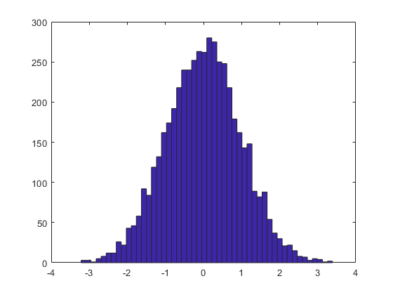
To visualise the difference between these two random number distributions, we can use the command 'hist' to display the histogram of each matrix. The histogram is a well-known statistical graphical representation of the distribution of data, which divides the range of a number of values into a series of "bins", the values are then assigned to a specific bin and the number of values per bin is counted. Each bin is then displayed with a height proportional to the number of elements it contains. To display the histogram of the elements of a matrix, we can type:
hist(matrix_9(:),50)
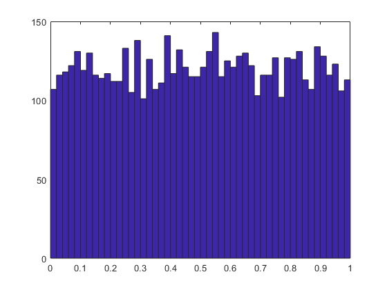
and this generates a histogram with 50 equally spaced bins. Notice that the colon operator has been used once more, in this case it is necessary as the matrix is three-dimensional and we are only interested in the histogram of all values of the matrix regardless of their position within the matrix. Similarly we can visualise the histogram with the Normal distribution:
hist(matrix_10(:),50)
Statistics in Matlab
Some of the most useful functions of Matlab are those related with the calculation of statistical measurements like the mean or standard deviation. As in the previous cases, it is important to distinguish if you want to obtain a single measurement, the mean for instance, for all the values of a matrix, or alternatively, you are interested in obtaining mean values per column, per row, per level, etc. If we are interested in the arithmetic mean of all the values of a matrix we can use the colon operator to re-arrange the matrix into a single column and the calculate the mean value in the following way:
mean_matrix_9 = mean(matrix_9(:))
mean_matrix_9 =

    0.4996
The previous command calculates the average value of the elements of the 'matrix_9' and stores them in a new variable called 'mean_matrix_9'. If we use the function 'mean', without the colon operator, Matlab will calculate the mean for each individual column of the matrix, and thus the result would be a matrix of one row, sixteen columns and twenty five levels. We should recall that the original matrix had dimensions (15,16,25). We can then calculate the mean value of each dimension of a matrix. To do this we need to indicate the dimension of interest like this:
mean_matrix_column      = mean(matrix_9,1);
mean_matrix_row         = mean(matrix_9,2);
mean_matrix_level       = mean(matrix_9,3);
It is possible to pass the output of a function as an input argument of another function and thus concatenate the effect of the functions. For example, we can concatenate two commands 'mean' in a single instruction like this: 'mean(mean(matrix_9))'.
The innermost 'mean' function calculates the average of the columns, the second function calculates the average per row, as the columns will only have one element and you cannot calculate a average of a single element. To calculate the average values over the third dimension, the levels, we can use a third 'mean' function like this:
mean(mean(mean(matrix_9)))
ans =

    0.4996
As 'matrix_9' has three dimensions, this last instruction has calculated the average value of the all the elements and it is equivalent to 'mean(matrix_9(:))'.
In the same way the average value is calculated, other statistical measurements are easily computed. In some cases, it may be useful to store these values in a single variable, which can be saved and later compared against other the measurements obtained from a different process. We can easily combine different values by placing them in between square brackets to form a new matrix like this:
stats_observation_1     = [ mean(observation_1)    min(observation_1) ...
                            max(observation_1);    median(observation_1)...
                            sum(observation_1) std(observation_1)]
stats_observation_1 =

    0.0237   -1.0000    0.9989
    0.0243    2.8713    0.7113
Notice that again we wrote the instruction over several lines by using three consecutive dots ("...").
So far, we have calculated the 'mean', 'median', minimum and maximum values, the sum of all elements and the standard deviation and stored them in single variable called 'stats_observation_1'. There are some other statistical calculations whose result is not a single value, but rather a series of values. Two of the most useful ones are the commands 'sort' to arrange the elements of a vector in ascending or descending order, and 'cumsum', which performs the cumulative sum of the elements in a matrix. We can visualise these commands with the previously created variables of observation_1. Again we will sort the elements in the same instruction as the plot:
figure
plot(time_range,observation_1,'b-o',time_range,sort(observation_1),'r--x');
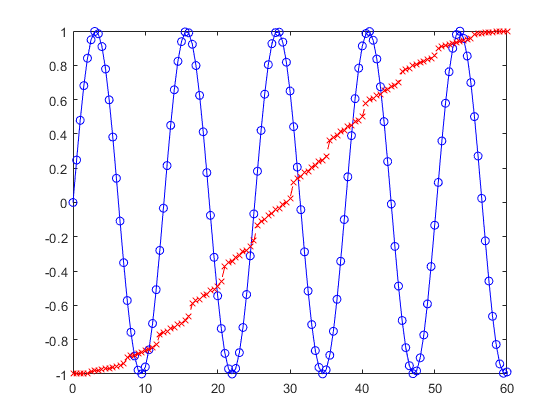
The sorted values of the sine function span the range from minus one to plus one as expected. What is probably more interesting to observe is that the increments between the values are not perfectly uniform, but rather have "jumps" that separate some regions where the increments are smaller.
Reading Financial Data
With Matlab it is possible to read data from sites like Yahoo! If you want to do this seriously, there is the specialised Datafeed Toolbox, which allows you to handle financial data from data service providers, but for this tutorial we will access the data directly.
First, you need to find the data to download. You can navigate around to find the data you are interested, say you find the page in yahoo, there is a link to download. You could do this and then read the downloaded file, but you can also read directly if you change the word "download" to "chart" in the url. For instance, the following two addresses will collect data from Google and Boeing:
url_BA   ='https://query1.finance.yahoo.com/v7/finance/chart/BA?period1=1561884125&period2=1593506525&interval=1d&events=history';
url_GOOG ='https://query1.finance.yahoo.com/v7/finance/chart/GOOG?period1=1561885836&period2=1593508236&interval=1d&events=history';
The url also contains the period to download (in Unix time stamp, more on that later), how you want to download, in this case daily (interval=1d) but you can retrieve weekly (interval=1wk) or monthly (interval=1mo) and the historical prices (events=history), and similarly you can opt for dividends (events=div), or stock split (events=split).
Downloading the data from the servers
Then you need to download from the url. If you use 'urlread', the data is in JSON format, you need to decode it to make sense of it. If you use webread, you will download directly as a struct.
% (read with webread)
opts = weboptions('UserAgent','Mozilla/5.0');
data_BA         = webread(url_BA,opts);
data_GOOG       = webread(url_GOOG,opts);
% (read with urlread, earlier version)
% data_BA_JSON    = urlread(url_BA);
% data_BA         = jsondecode(data_BA_JSON);
% data_GOOG_JSON  = urlread(url_GOOG);
% data_GOOG       = jsondecode(data_GOOG_JSON);
The data is now in a 'struct' with many fields, the metadata can be found here:
data_BA.chart.result.meta
ans =

  struct with fields:

                currency: 'USD'
                  symbol: 'BA'
            exchangeName: 'NYQ'
          instrumentType: 'EQUITY'
          firstTradeDate: -252322200
       regularMarketTime: 1.6306e+09
               gmtoffset: -14400
                timezone: 'EDT'
    exchangeTimezoneName: 'America/New_York'
      regularMarketPrice: 220.5100
      chartPreviousClose: 364.0100
               priceHint: 2
    currentTradingPeriod: [1×1 struct]
         dataGranularity: '1d'
                   range: ''
             validRanges: {11×1 cell}
The quotes are found here
data_BA.chart.result.indicators.quote
ans =

  struct with fields:

       low: [252×1 double]
    volume: [252×1 double]
      high: [252×1 double]
      open: [252×1 double]
     close: [252×1 double]
And the dates in 'data_BA.chart.result.timestamp'. The values here are in UNIX time stamp, which are the seconds since 1 January 1970, thus, these need converting to something more readable. This can be done with the following command:
dates = datestr(data_BA.chart.result.timestamp(:)/86400+datenum(' 1-Jan-1970'),'dd/mm/yyyy');
(In case you are interested, the 86400 corresponds to the number of seconds in a day, then you have to shift from the UNIX time stamp, and you provide the format of the dates. For serious analysis you should also consider the shift for the corresponding time zone, but this is just an example).
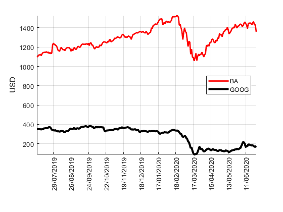
Now we can visualise
figure
h1      = gca;
hold on
h2      = plot(data_GOOG.chart.result.indicators.quote.open,'r-','linewidth',2);
h3      = plot(data_BA.chart.result.indicators.quote.low,'k-','linewidth',3);
legend('BA','GOOG','location','best')
grid on
axis tight
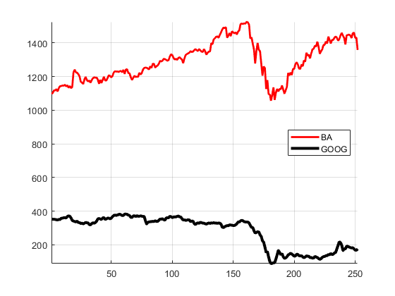
And to set the correct dates we modify the handles of the axes:
h1.Position=[0.1300    0.2719    0.7750    0.6531];
h1.XTick=(20:20:252);
h1.XTickLabel=dates(20:20:252,:);
h1.XTickLabelRotation=90;
h1.YLabel.String = data_GOOG.chart.result.meta.currency;
Sound as 1D Signals
Matlab is useful and powerful while handling audio files. You can visualise and hear an audio signal in the following way. First, you need to load the data, which in this case is part of Matlab so there is no need to specify the actual location in a computer.
load handel
You will notice that two variables are loaded to the workspace. One called 'y' which is a matrix with 73,113 values, and a second called Fs, with a single value of 8192. This second variable corresponds to the number of samples per second.
First, we can visualise the data as a line with a plot
figure
plot(y)
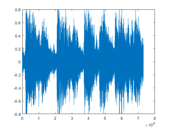
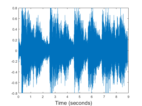
Notice that the vertical axis indicates values between -1 and 1 and the horizontal axis between 0 and 73,113. Since we know that there are 8192 samples per second, it would be better to display this axis in seconds, we can do this by creating an axis in seconds, and using it in the plot:
time_axis   = (1:size(y))/Fs;
plot(time_axis,y)
xlabel('Time (seconds)','fontsize',16)
We can now listen to the sound. It is necessary to have speakers or other audio device in your computer.
sound(y)
It is easy now to manipulate the signal and at the same time the sound, for instance
sound(0.5*y(1:8192))
The 0.5 value controls the volume, (if you are in a common room try not to disturb other users!). Notice also that the sound has been restricted to the first second by selecting the first 8192 values of the matrix.
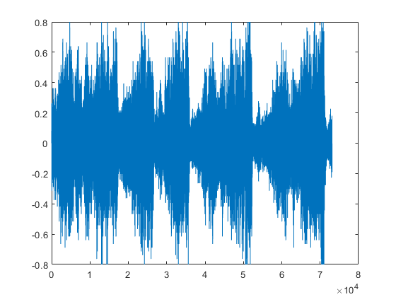
Other manipulations are fairly simple to do, for instance to play the sound backwards, you can address the matrix in reverse order:
plot(y(end:-1:1))
sound(y(end:-1:1)*0.5)
To subsample the data we can skip every other value, notice what happens with the sound!
plot(y(1:2:end))
sound(y(1:2:end)*0.5);
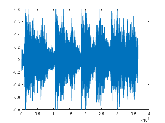
By discarding half the samples, the signal jumps one octave up by duplicating the frequency. So far, the number of samples per second has not been modified, but this can easily be changed. To slow the sound we can reduce its value
sound(y,Fs/2)
Therefore, by reducing the frequency and the number of values at the same time, we can keep the same sound, but notice the quality of the sound when one in every four values is used
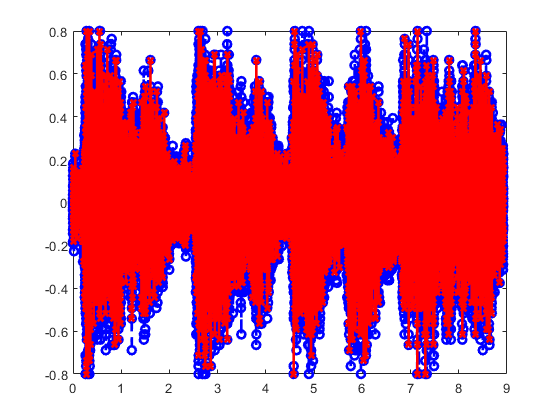
plot(time_axis,y,'b--o',time_axis(1:4:end),y(1:4:end),'r-x','linewidth',2)
sound(y(1:4:end)*0.5,Fs/4);
To appreciate the difference between the two signals we need to zoom in to visualise a few samples:
axis([0.2282 0.25212 -0.4 0.4 ])
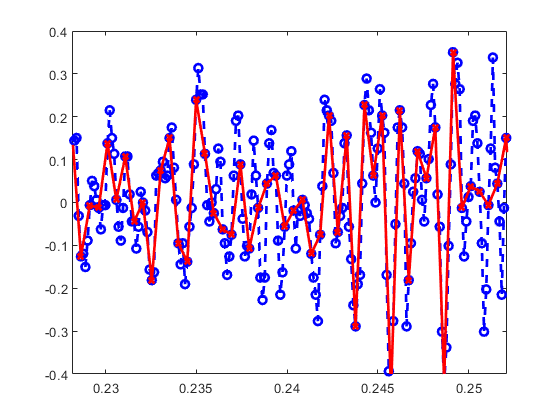
Notice how we displayed two signals at the same time and how it is possible to zoom into a section with the command 'axis'.
Reference
This file is part of the material used to introduce Matlab. All these materials are based on the book
  Biomedical Image Analysis Recipes in Matlab
  For Life Scientists and Engineers
  Wiley, July 2015
  Constantino Carlos Reyes-Aldasoro
  http://eu.wiley.com/WileyCDA/WileyTitle/productCd-1118657551.html
Disclaimer
These files are for guidance and information. The author shall not be liable for any errors or responsibility for the accuracy, completeness, or usefulness of any information, or method in the content, or for any actions taken in reliance thereon.