Tutorial: Publication-Quality Figures
Contents
Numerous plots in one figure.
In some journals such as "Nature" and its affiliates, the figures normally contain not just one panel, but several related graphs and images in a single figure. These figures can be generated with graphical-oriented softwares like illustrator, photoshop, corel or even powerpoint. However, you can do that directly in Matlab. The greatest advantage of doing these in Matlab is that if you need to change something (and you always need to at one stage or another) is that, since the image is created in code, you only need to run your code again, without having to manually arrange subfigures.
In this tutorial we simulate three longitudinal data sets in the following way:
experiment_1(:,1)    = 0.8*randn(1000,1);
experiment_1(:,2)    = 1*randn(1000,1);
experiment_2(:,1)    = -10+1.8*randn(1000,1)+linspace(-3,3,1000)';
experiment_2(:,2)    = -10+3*randn(1000,1);
experiment_3(:,1)    = 6+3.7*randn(1000,1)+linspace(3,-3,1000)';
experiment_3(:,2)    = 11+1.3*randn(1000,1);
Now we create the figure where all will be displayed:
figure; set(gcf,'position',[ 100 300 1000 500])

Let's add the first subplot with a simple plot of each experiment:
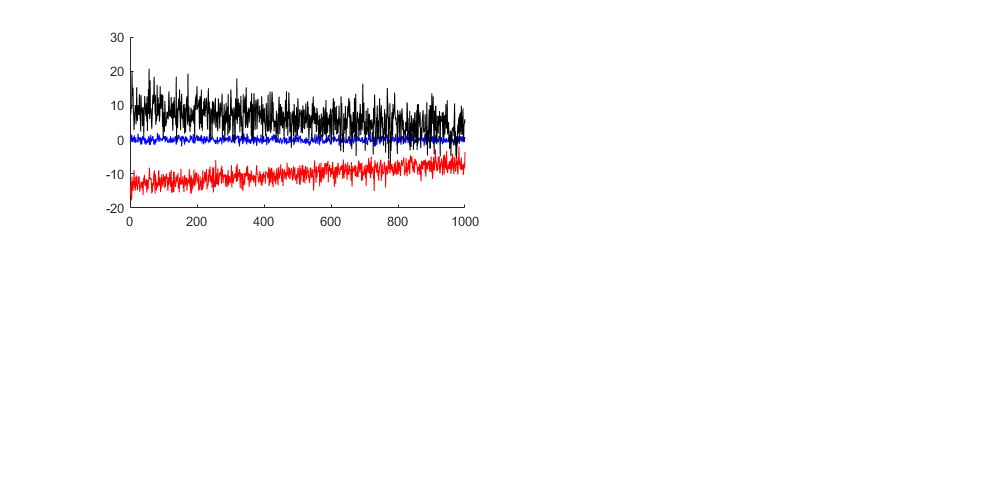
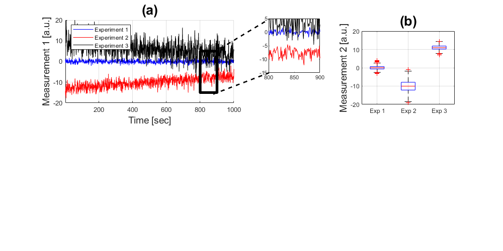
handle1 = subplot(221);
hold on
plot((1:1000),experiment_1(:,1),'b',...
    (1:1000),experiment_2(:,1),'r',...
    (1:1000),experiment_3(:,1),'k')
Adding lines, titles and labels
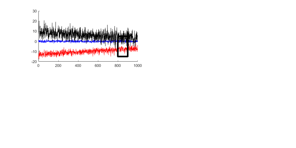
Sometimes you want to draw a Region of Interest, in this case we can do that with one extra plot (four segments -> five points)
plot([800 900 900 800 800],[ 5 5 -15 -15 5],'k','linewidth',4)
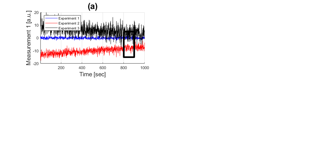
Add a title, labels and a legend
title('(a)','fontsize',20)
xlabel('Time [sec]','fontsize',14)
ylabel('Measurement 1 [a.u.]','fontsize',14)
legend('Experiment 1','Experiment 2','Experiment 3','Location','Northwest')
axis([1 1000 -20 20]); grid on
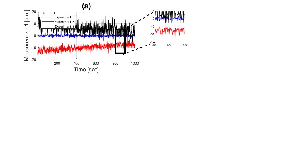
Zooming in
If you want to highlight the data in a specific region of interest, you can display it in a separate plot and then zoom in using the command 'axis'.
handle2 = subplot(3,6,4);
plot((1:1000),experiment_1(:,1),'b',...
    (1:1000),experiment_2(:,1),'r',...
    (1:1000),experiment_3(:,1),'k')
axis([800 900 -15 5])

A better way to do this would be to save the coordinates that you want to zoom in as variables so that you can change them at the same time whilst drawing the box and zooming in.
To connect the two regions of interest, we can draw some dashed lines between the two of them:
line1 = annotation(gcf,'line',[0.424    0.535],[0.79    0.9237],...
    'linewidth',2,'linestyle','--');
line2 = annotation(gcf,'line',[0.424    0.535],[0.6250    0.7100],...
    'linewidth',2,'linestyle','--');
Descriptive Statistics: Boxplots
Now we can leave those displays and add a new way of showing the data, this can be done with boxplots, which show the extent of the distribution of each experiment:
handle3 = subplot(2,3,3);
boxplot([experiment_1(:,2),experiment_2(:,2),experiment_3(:,2)],...
    {'Exp 1','Exp 2','Exp 3'})
axis([0.5 3.5 -20 20]); grid on
ylabel('Measurement 2 [a.u.]','fontsize',14)
title('(b)','fontsize',20)
Scatter plots
Yet another way to show how the data distributes is with scatter plots, this can be done in a number of dimensions, which is good to show the distributions.
handle4 = subplot(2,2,3);
handleScatter = plot(experiment_1(:,1), experiment_1(:,2),'b.',...
                     experiment_2(:,1), experiment_2(:,2),'r+',...
                     experiment_3(:,1), experiment_3(:,2),'kx');
axis([-20 20 -20 20]); grid on
xlabel('Measurement 1 [a.u.]','fontsize',14)
ylabel('Measurement 2 [a.u.]','fontsize',14)
legend('Experiment 1','Experiment 2','Experiment 3','Location','Northwest')
title('(c)','fontsize',20)
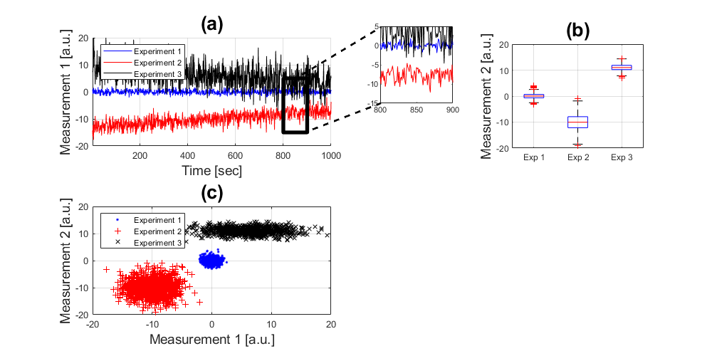
Notice how different the plots look like.
Two Dimensional Histograms
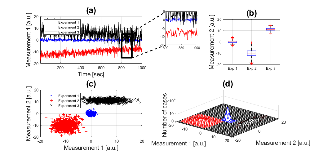
Finally, let's display the same data in a different way, this time with histograms. First, calculate the one-dimensional histograms:
experiment_1_x       = hist(experiment_1(:,1),(-20:20));
experiment_1_y       = hist(experiment_1(:,2),(-20:20));
experiment_2_x       = hist(experiment_2(:,1),(-20:20));
experiment_2_y       = hist(experiment_2(:,2),(-20:20));
experiment_3_x       = hist(experiment_3(:,1),(-20:20));
experiment_3_y       = hist(experiment_3(:,2),(-20:20));
Now, we can approximate the 2D histograms from the 1D histograms:
handle5 = subplot(2,2,4);
hold on
mesh((-20:20),(-20:20),experiment_1_x'*experiment_1_y,'edgecolor','b');
mesh((-20:20),(-20:20),experiment_2_x'*experiment_2_y,'edgecolor','r');
mesh((-20:20),(-20:20),experiment_3_x'*experiment_3_y,'edgecolor','k');
xlabel('Measurement 1 [a.u.]','fontsize',14)
ylabel('Measurement 2 [a.u.]','fontsize',14)
zlabel('Number of cases','fontsize',14)
title('(d)','fontsize',20)
view(40,60); axis tight; grid on
Annotations
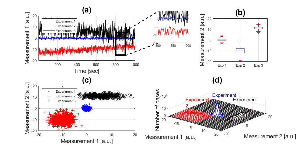
To complete any graph, you can add a number of annotations, arrows, boxes, etc. In this case, we will add text boxes with the names of the experiments:
annotation(gcf,'textbox',[0.71 0.34 0.0865 0.048],'String',{'Experiment 1'},...
    'color','b','linestyle','none','fontsize',12);
annotation(gcf,'textbox',[0.62 0.31 0.0865 0.048],'String',{'Experiment 2'},...
    'color','r','linestyle','none','fontsize',12);
annotation(gcf,'textbox',[0.78 0.31 0.0865 0.048],'String',{'Experiment 3'},...
    'color','k','linestyle','none','fontsize',12);
Reference
This file is part of the material used to introduce Matlab All these materials are based on the book:
   Biomedical Image Analysis Recipes in Matlab
   For Life Scientists and Engineers
   Wiley, July 2015
   Constantino Carlos Reyes-Aldasoro
http://eu.wiley.com/WileyCDA/WileyTitle/productCd-1118657551.html
Disclaimer
These files are for guidance and information. The author shall not be liable for any errors or responsibility for the accuracy, completeness, or usefulness of any information, or method in the content, or for any actions taken in reliance thereon.