Chapter 16 Data visualisation and analysis in Excel
16.1 Pivot tables and filters
We saw in lectures how a pivot table is set up and used. Here we will briefly review some of the technical details.
When setting up a spreadsheet range for use as a pivot table, we need
to have the data in columns, with columns labelled in a suitable
manner. On selecting the Pivot Table option from the ribbon, we first
have to choose a data source. This can be from an external
application, but will usually just be a range of cells (which can be
selected by highlighting them). We also have to select where the data
is displayed; usually it is best to put the pivot table on a new
worksheet, so that it does not interfere with the data being analysed.
Having chosen our data, we have to choose which fields (i.e., columns) should appear in our table. As we choose fields, they will be added to either the rows or the columns of our pivot table, usually in a sensible way. But once we have added our data, we are free to drag fields from one place to another in the layout section of the design.
If we have multiple entries in our column then they will be ordered first by the top field, and then elements of that field will be ordered by the second field, and so on. In our example in lectures we could order regions with salespeople below them, or order by people with their regions below instead. The order can be changed by dragging entries around.
Once we have chosen our rows and columns, and our filters, we can refine the selection by clicking on the arrow that appears when we mouse over a field in the list of possible fields. This brings up various sorting options, and also the ability to remove individual items from the list.
Eventually we will have our rows and columns laid out as we
desire. Then we can choose the method of calculation. The default for
numerical columns is to sum the values, but clicking on an entry in
the Value pane brings up a menu including the Value Field Settings option. Here we can choose from a number of basic
operations (such as sums, averages, products) in the first tab. In the
second tab we can choose how to present values, either as raw
calculations, as percentages of various different totals, as running
totals, or in ranked order.
Pivot tables are very powerful tools for manipulating data. Even in the simple example in lectures, we can compare the performance by region, by salesperson, compare the performance of salespeople across regions, and various other combinations. With power comes a little complexity, and so pivot tables are best experimented with to learn how they operate.
Filters are much less powerful, but much simpler to use. On applying a filter to a table, each column heading acts like an individual filter in a pivot table. Thus by clicking on the column headings we can select which entries to display, and in what order. We can combine filter choices from multiple columns to refine our data further. Filters are most useful where the data is already in a sensible format, but simply too extensive to be handled as a whole. Applying a filter allows us to focus in on the entries that matter to us.
16.2 The LINEST function and trendlines
The LINEST function calculates the “best” straight line through a set of points, but how does it do this? The formulas for doing so are quite straightforward, and you may already have seen them in your Probability and Statistics modules.
Given a table of values \((x_1, y_1), \ldots, (x_n, y_n)\) we wish to calculate the best line of the form \[y=\alpha x+\beta\] through these points. To do this we first calculate the means \(\overline{x}\) of the \(x_i\) and \(\overline{y}\) of the \(y_i\) using the formulas \[\overline{x}=\frac{1}{n}\sum_{i=1}^nx_i\quad\quad\text{and}\quad\quad \overline{y}=\frac{1}{n}\sum_{i=1}^ny_i.\] Now the gradient \(\alpha\) is calculated as \[\alpha=\frac{\sum_{i=1}^n(x_i-\overline{x})(y_i-\overline{y})} {\sum_{i=1}^n (x_i-\overline{x})^2}\] and the intercept \(\beta\) by \[\beta=\overline{y}-\alpha\overline{x}.\] This line is regarded as the best because it minimises the value of \[\sum_{i=1}^n\left(y_i-(\beta+\alpha x_i)\right)^2\] and this is called the least squares approximation.
The regression coefficient \(r\), which tells us how good is the correlation between the \(x_i\) and \(y_i\) values, is given by \[r=\frac{\sum_{i=1}^n(x_i-\overline{x})(y_i-\overline{y})} {\sqrt{\sum_{i=1}^n(x_i-\overline{x})^2(\sum_{i=1}^n(y_i-\overline{y})^2}}.\] If \(r\approx 1\) then the values are well correlated.
The syntax of the LINEST command is
=LINEST(yvalues,xvalues,[constant],[statistics])
Here yvalues and xvalues are the collections of \(y\) and \(x\) values.
The value of constant is TRUE (the default) if the intercept
\(\beta\) is to be computed, and FALSE if \(\beta\) is assumed to be
\(0\).
The value of statistics is TRUE if the full regression
statistics are to be returned. These will appear in a table of the
form
\[\begin{array}{ll}
\text{slope} & \text{intercept}\\
\text{std error in slope}& \text{std error in intercept}\\
r^2& \text{std error in $y$ estimate}
\end{array}\]
where \(r\) is the regression coefficient. There is a good correlation between the \(x_i\) and \(y_i\)
values if \(r\approx 1\).
This function returns a table of values rather than a single cell entry. This means it needs to be entered in a special manner.
Usually a function entered into a cell will return a value in the same cell, and clearly that will not be good enough for the LINEST function.
Functions such as LINEST which return several values in a table are called array functions and need to be entered in a special manner. To enter the **
As an example of the use of the LINEST function, consider the values shown in Cells A1:B10 in Figure 16.1. Here the cells D2:E4 were selected, and the function
=LINEST(B1:B10, A1:A10, TRUE, TRUE)
was entered. The value of the slope is shown in cell D2, and of the intercept in E2. The remaining values displayed we have not discussed, except for the value in cell D4 which equals \(r^2\).
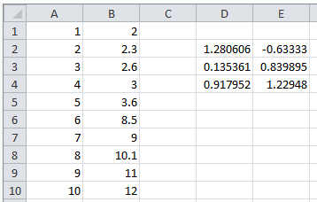
Figure 16.1: Using the LINEST function
We can also calculate various other lines of best fit using the
trendlines option for scatter charts. Having
displayed a scatter chart
with the points not connected in our spreadsheet (via the
Insert tab, as described
below), we can then right click on a point and select Add Trendline. This will bring up a window with various types of
trendlines which we can choose. At the bottom of the window we have
the option to display the equation used for the trendline, and it’s
\(r^2\)-value. For example, if we take the data in Figure 16.1
and add a linear trendline we get the chart displayed in Figure
16.2.
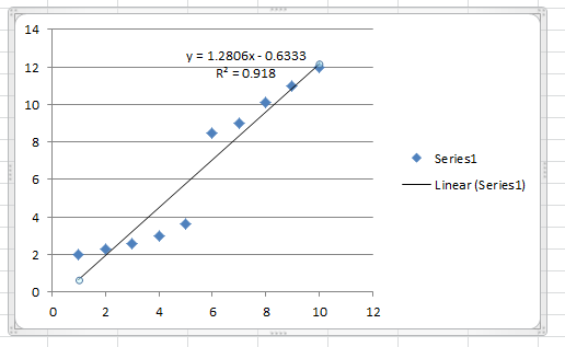
Figure 16.2: Adding a linear trendline to the data from Figure 16.1
16.3 Charts and sparklines
Given a table of data with column and row headings, it is easy to construct a chart to display this data. The choice of chart is partly aesthetic, and partly related to the kind of data which you wish to display.
To display a chart, select the table of data with the mouse and then
go to the Insert tab in the main ribbon. Here you will
find a variety of charts to choose from. The most common ones (Column,
Line, Pie, Bar, and Area) are listed separately, but you may find
some of the other types useful too. Each type has many sub-types to
choose from.
Once you choose a type it will be displayed in the sheet, and a new
Design tab will now be displayed. Here you can change many
aspects of the chart. You can change the type completely, switch over
the roles of row and column, or choose from a variety of layouts and
colour styles. These latter options are very extensive, and only a
small selection are visible initially. To see further options click on
the lower arrow icon to the right of the row which will bring up a
complete list.
Suppose for example that we have the data shown in Figure 16.3. We have a list of cities, and associated values for each year.
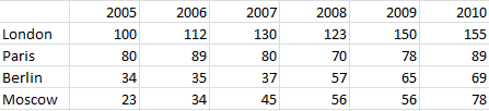
Figure 16.3: A sample table for displaying as a chart
We can display these as a basic column chart or as subdivided columns (Figures 16.4 and 16.5).
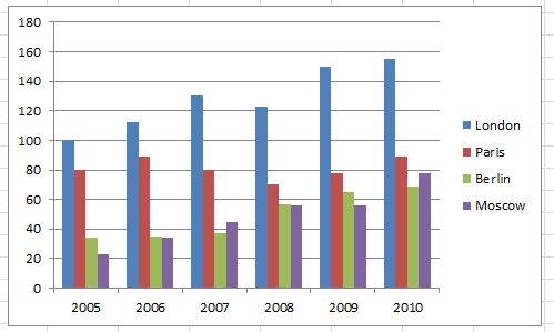
Figure 16.4: A simple bar chart
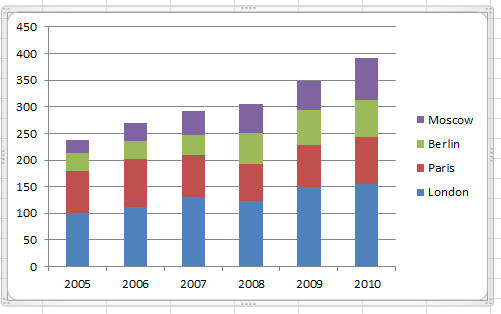
Figure 16.5: A slight more sophisticated bar chart
Alternatively we could use a line chart or scatter chart (Figures 16.6 and16.7)
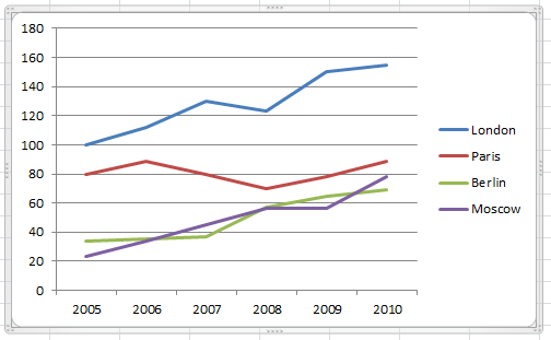
Figure 16.6: A line chart
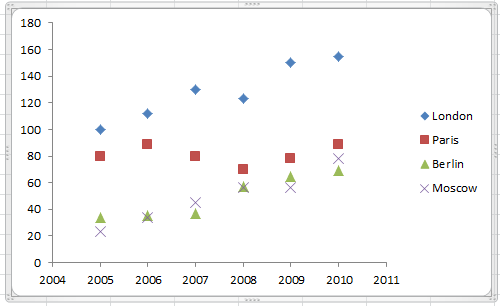
Figure 16.7: A scatter chart
Or even as a “donut” (Figure 16.8).
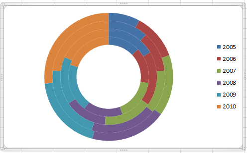
Figure 16.8: A donut chart
When selecting your chart, you should consider ease of understanding above all else. Ask yourself whether the chosen format efficiently conveys the information in an intelligible manner. The most useful chart types are usually the bar, column, and line charts. Scatter charts may also be useful for data which is a sample from a continuous range, possibly with some form of curve added to connect the points. Notice how the donut type, although pretty to look at, is rather mysterious in that it does not explain what the different layers correspond to.
Three chart types are worthy of further note. Pie charts only work with a single column of data, while Stocks charts require the data in a special form. This type is also useful for data with uncertainty (such as scientific measurements) where we want to keep track of the “error bars”.
Finally, spider charts play a special role. They are often used to display the relative strengths and weaknesses of various entities in a number of characteristics. For example, suppose we have the following data.
| Country | Troops | Tanks | Fighters | Warships | Missiles |
|---|---|---|---|---|---|
| Ruritania | 100,000 | 1200 | 230 | 88 | 12,000 |
| Erewhon | 120,000 | 1800 | 200 | 44 | 13,000 |
| Oceania | 110,000 | 600 | 300 | 65 | 10,000 |
| Eastasia | 80,000 | 800 | 280 | 65 | 8,000 |
| Eurasia | 60,000 | 500 | 250 | 70 | 8,000 |
| Average | 94,000 | 980 | 252 | 66.4 | 10,200 |
If we want to study the relative strengths and weaknesses of the various armies we could try and plot these values, but the enormous number of troops would drown out all other data. Instead, we first normalise the data by dividing each cell by the average of that column, to give the data in the following form.
| Country | Troops | Tanks | Fighters | Warships | Missiles |
|---|---|---|---|---|---|
| Ruritania | 1.0638 | 1.2245 | 0.9127 | 1.3253 | 1.1764 |
| Erewhon | 1.2766 | 1.8367 | 0.7937 | 0.6627 | 1.2745 |
| Oceania | 1.1702 | 0.6122 | 1.1905 | 0.9789 | 0.9804 |
| Eastasia | 0.8510 | 0.8163 | 1.1111 | 0.9789 | 0.7843 |
| Eurasia | 0.6383 | 0.5102 | 0.9921 | 1.0542 | 0.7843 |
It is still not easy to see the relative strengths from the table alone. But now the spider chart in Figure 16.9 makes it quite easy to see how the relative armies compare.
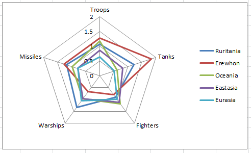
Figure 16.9: A spider chart
Sparklines can be used instead of charts to provide simple visual representations of a single line of data. Examples of line and bar sparklines can be seen in Figure ??. The main advantage of sparklines is the small amount of space occupied, so you may find them useful in situations where a full chart will not fit.
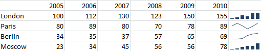
Figure 16.10: Examples of sparklines