Chapter 25 Plotting data in Python: Using Matplotlib and Seaborn
25.1 Matplotlib
We have given a very stripped-down introduction to Matplotlib in lectures, and it is not possible to cover all of the many features. We saw examples of some of the options that can be used (for example to add captions, or label axes) but there are many more. Here we will focus on either expanding upon details mentioned in the lectures, or signposting further features which you may wish to explore.
A very useful resource is Chapter 4 of the Python Data Science Handbook by Jake VanderPlas (one of the recommended texts for this module). The content of this is available for free at
https://jakevdp.github.io/PythonDataScienceHandbook/
and we will refer to this as PDSH in what follows.
In lectures we used the plt.show command to display our results. When this command is run, it looks at all of the various plot objects that are currently active, and displays them to the screen. This should only be run once in a given file, and so is usually put near the end. You may instead want to create plots more interactively using console commands. Details on how to do this can be found in PDSH.
The method we used to create plots used the pyplot package (you may have noticed that we imported matplotlib.pyplot instead of just matplotlib). This is a simple and more old-fashioned method that works well for more basic plots.
There is a more modern, more object oriented approach where we explicitly create different Figure and Axes objects which you may see if you look at other resources online. The Figure object contains all aspects of the final Figure, while the Axes object contains the part of the Figure with the coordinate frame, labels, and (eventually) the plots that we draw. To set up these initial objects up we use the commands plt.figure() and plt.axes(). This method is discussed in more detail in PDSH which switches freely between the two approaches.
There are many plotting options that we did not consider. It is possible to control the colour of each plot, the style of line (for example dotted, dashed, or solid), and the precise range of values displayed on each coordinate axis. All of these are discussed in PDSH.
With the advent of more modern graphics packages, matplotlib has been updated to provide some of the same features. The most obvious of these is the introduction of styles. We saw how to use the ggplot style using the command
plt.style.use("ggplot")
but there are many other possibilities. A list of the alternatives to ggplot can be found at
http://tonysyu.github.io/raw_content/matplotlib-style-gallery/gallery.html
which also illustrates what each one looks like on a variety of different kinds of plot.
To illustrate something a little more sophisticated we will consider an example of a scatter plot. This is a different method for creating a plot of points, where the size and colour of each point can be individually controlled. Python contains various classic examples of datasets, and in the following example we will consider a famous dataset about iris flowers, which is included in the Scikit-Learn library. The following code is taken from PDSH.
import matplotlib.pyplot as plt
from sklearn.datasets import load_iris

iris = load_iris()
features = iris.data.T

plt.scatter(features[0], features[1], alpha=0.3,
            s=100*features[3], c=iris.target,
            cmap="viridis")
plt.xlabel(iris.feature_names[0])
plt.ylabel(iris.feature_names[1])
which produces the plot in Figure 25.1.
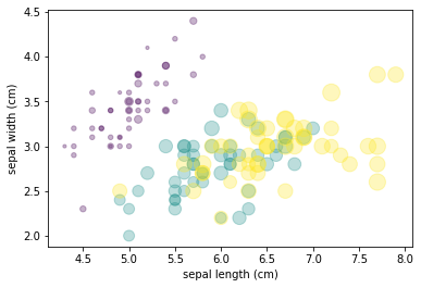
Figure 25.1: An example of a scatter plot generated from the iris dataset
Here the first line loads the data (which is in the form of an array) into an object called iris and then transposes this. A scatter plot is formed where the x coordinate is the length of a sepal (stored in features[0]) and the y coordinate is the width of a sepal (stored in features[1]).
These points are plotted using different sizes and colours using the s and c options, where the size is related to the width of the petals, and the colour depends on the species of flower. The option cmap="viridis" chooses a standard colour scheme for these colours.
We also used a command that is very useful in many plots, which adjusts the transparency of the points themselves. Setting alpha=0.3 allows overlapping plots to show through each other (and we can vary this to get different effects).
Finally notice how the scatter options fit over several lines. As Python uses indentation, we cannot simply break a line by using the Return key, as in general this will produce a new line of code. However, if we are inside a pair of brackets (as in this case) then the editor will automatically indent the code to match the bracket and thus allow the use of multiple lines.
Looking at the plot in Figure 25.1 you can see how powerful this method is for presenting data. It is clear that one species (labelled in purple) is quite distinct, and we can see how the various sepal dimensions and the petal width are related.
An important topic that we have not considered is how to produce plots of three-dimensional surfaces using matplotlib. Details (as usual) can be found in PDSH. You will also find there how to combine data with a geographic map and other more advanced topics.
Finally, let us consider how to export plots to a file. We saw two methods in lectures, one for basic plots and one for Series and DataFrames. The difference corresponds to the two methods to create plots (the basic or the more object oriented) mentioned at the start of this section. In either case we can export to a wide variety of file types, and Python will identify which type to use depending on the name that we give to the file extension. The default is to export as a .png file, but we can also produce .pdf, .jpeg, and many others.
25.2 Seaborn
The Seaborn package was designed to modernise the look of plots generated with matplotlib, and to provide a front end that made it easy to generate certain more advanced plot types without having to code them in matplotlib itself. With the advent of styles the first of these aims is much less important, so we will mainly focus on the second aspect here.
To use Seaborn add the line
import seaborn as sns
at the top of your code, after you import matplotlib. Seaborn has various styles:
- darkgrid
- whitegrid
- dark
- white
- ticks
which you can choose using the command
sns.set_style("darkgrid")
or similar. Versions of these styles have been created for the basic matplotlib style command.
More information on using Seaborn (including how to change the colour palettes, and some nice examples) can be found at
https://www.tutorialspoint.com/seaborn/seaborn_quick_guide.htm
Seaborn includes a number of example datasets that we can use to illustrate the various options available to us. All of the examples we will discuss are taken from the official Seaborn example gallery at
https://seaborn.pydata.org/examples/index.html
we will discuss neither the details of the various datasets, nor the precise syntax of the Seaborn commands (which can be found at the above link) but instead focus on the kind of data presentations that are possible.
Our first basic example in Figure 25.2 is a line plot with error bands. Notice the use of different colours and line types to highlight the different scenarios.
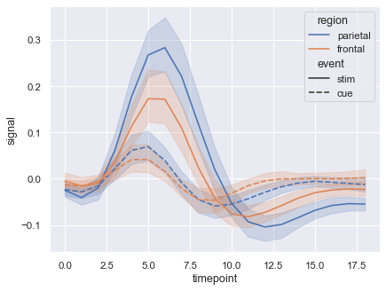
Figure 25.2: A line plot with error bands
Our next example is what is called a violin plot. Often used for comparing demographic data for men and women, it is here used to present the amount of money left as as tip by smokers and non-smokers on various days of the week.
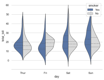
Figure 25.3: A line plot with error bands
Seaborn provides various ways of visualising marginal distributions. This is like a two dimensional barchart (the corresponding one dimensional data is given along the top and right edges), and our examples in Figures 25.4 and 25.5 represent these using hexagons and continuous approximations respectively. Given the relevant datasets these are produced respectively with the following single line of code:
sns.jointplot(x=x, y=y, kind="hex", color="\#4CB391")
and
sns.jointplot(data=penguins, x="length", y="depth", hue="species", kind="kde")
where only the color code is rather opaque.
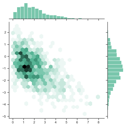
Figure 25.4: A hexbin plot
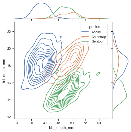
Figure 25.5: A joint kernel density estimate plot
Our final example in Figure 25.6 (there are many more we could have chosen) is a very useful means of looking for possible correlations between multiple sets of data. Here we have four variables (bill length and depth, flipper length, and body mass) for three species of penguins. Each pair of variables is plotted against each other so that we can see if any given pair demonstrates a strong correlation or other pattern of behaviour. For example, flipper length and body mass seem to correlate across all three species, more strongly than some of the other combinations.
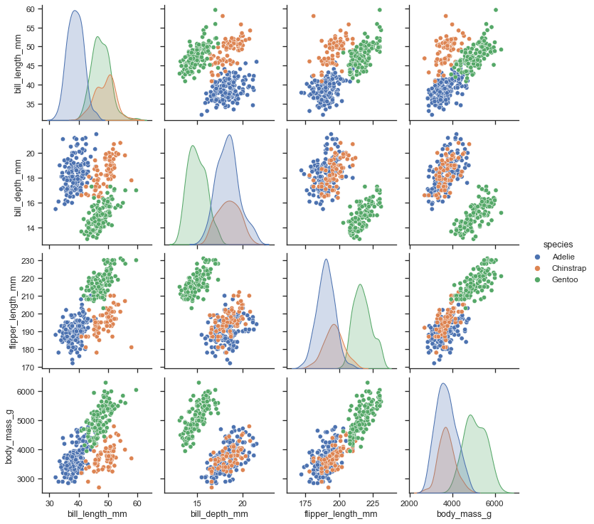
Figure 25.6: A matrix of scatterplots
This entire example was produced just using the code
import seaborn as sns
sns.set_theme(style="ticks")

df = sns.load_dataset("penguins")
sns.pairplot(df, hue="species")
together with a Pandas DataFrame of data on penguins.